
When working on UX Design for your eCommerce site, there is usually one goal in mind: to lead visitors down a sales funnel. Having a great product will obviously help with this goal, but that’s not all: the best way to ensure a sale is by designing a site that converts.
Learn how to make it happen by providing your customers with a positive, effortless experience.
1. Make Your Value Proposition Visible
It only takes two-tenths of a second for your visitors to form an opinion of your site and decide whether you fit their needs and what your offer is of value to them.
You must highlight your Value Proposition so visitors can quickly identify it and understand what makes your business a better option than competitors and what value they can get from doing business with you.
Read our post on how to craft a quality value proposition.
2. Use Visual Hierarchy and Simple Navigation
Visual hierarchy will help your customers know what to do next and will help you guide them to do what you want them to. Use sizes and colors, images, and layout to create a “shopper flow,” leading them to the “Thank you for your order” page.
There are five building blocks associated with visual hierarchy:
Size
Have you ever heard of Fitts Law? One of its principles basically states that the bigger the object, the easier it is to engage with. If we think about call-to-actions (CTAs), this can have a very practical use, but don’t think it’s as simple that the bigger, the better. Making a “Buy Now” button 10x larger will not bring more conversions. Coherence, harmony, and well-balanced design are critical. Size does not only affect CTAs, text, and images play the same game here.

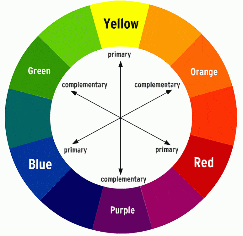
Color
We won’t go deep on color psychology now, but you need to acknowledge that different colors have diverse psychological connections.
Colors have their own hierarchy. Blacks and reds draw more attention than fade yellows or pastels. You can manipulate that hierarchy with a good understanding of contrasts and primary and complementary colors. See this Kissmetrics blog post on how colors affect purchases.
Layout
The layout defines your site’s interface, and with it, you can control your visual hierarchy in a straightforward way. Usability must always be in your mind whenever you implement your site’s layout.
Spacing
Hand in hand with layout, the spacing will allow you to control visual hierarchy with negative space and proximity.
The latter refers to an unconscious thought process where you will assign a similar purpose to grouped elements. Elements need to “breathe,” and the negative space around them plays a significant role. Also, bear in mind that negative space (or white space) helps to draw attention to elements correctly placed in that space.
Style
Better looking websites convert better, but style and design are, by definition, subjective concepts.
Web design trends evolve faster than slower. Although keeping up it’s not an easy task, and it’s always good to have your own identity, being alert to current web design trends is always a good practice to implement.
Remember that in web, design trends are defined as well by best converting or performing websites analysis.
Whenever you hear about “intuitive navigation,” it’s nothing but simplicity. There´s a fantastic UX book by Steven Krug called “Don’t Make Me Think,” which makes it really clear that intuitive and effective navigation is simple navigation.
3. Provide an Optimal Search Option
Either your customers know exactly what they want or need to search for it. That’s why optimizing your site with an effortless search experience will contribute to a cleaner and more effective UX.
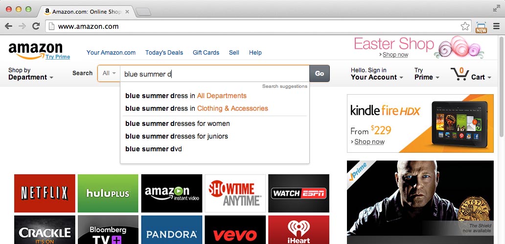
Put the search bar in an accessible place on the page. This is a general best practice, but even more for sites that offer a large number of products, and SEARCH is the best approach customers take to find what they are looking for.
Also, customers will have a better experience finding the products they want if the items and descriptions are rich with keywords.
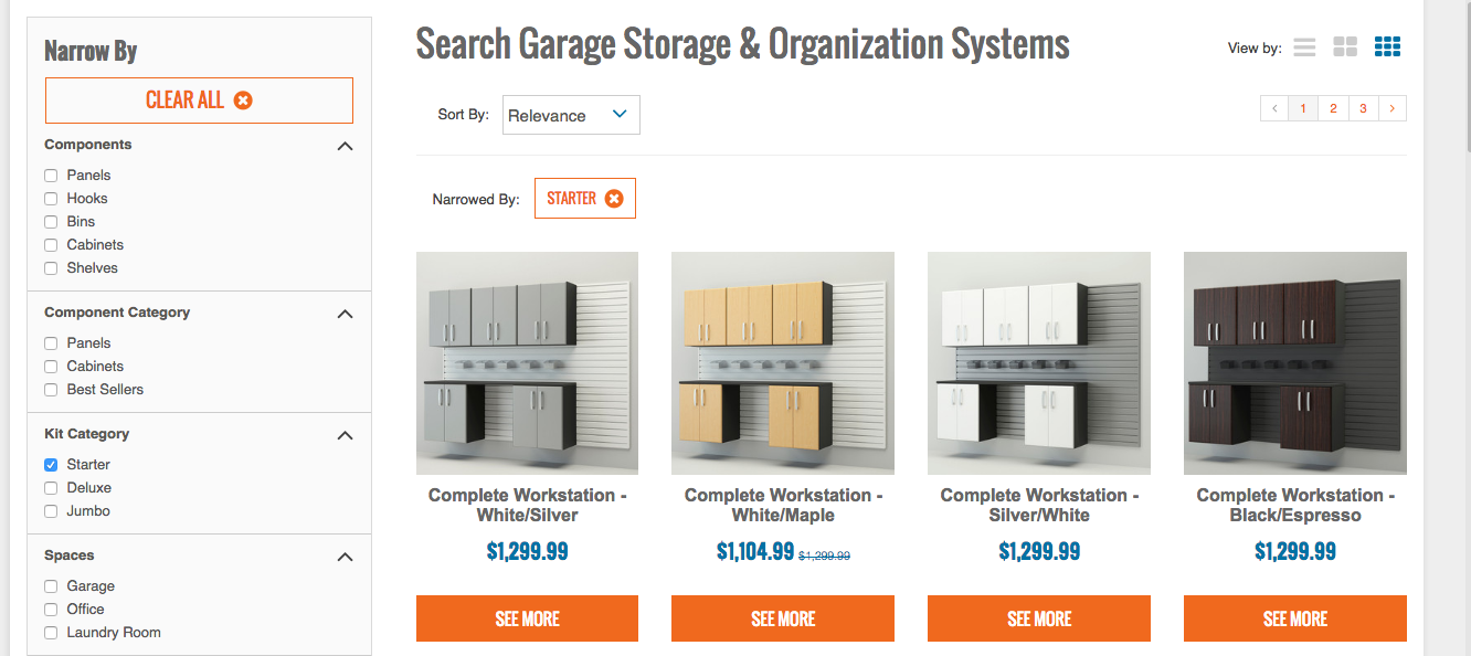
4. Product Filtering Relevancy
Adding filters to the site will make it easier to match the customer’s needs. Some filters could include brands, materials, prices, and sizes. The more relevant your filters, the better the user experience will be. Make sure your product categories have specific filters for that category.
5. The “No-Brainer” Checkout Process
Keep the checkout process simple. Let the customer perform each step of the process one page (or one step) at a time. Also, give them the option to check out as a guest rather than having to register for an account.
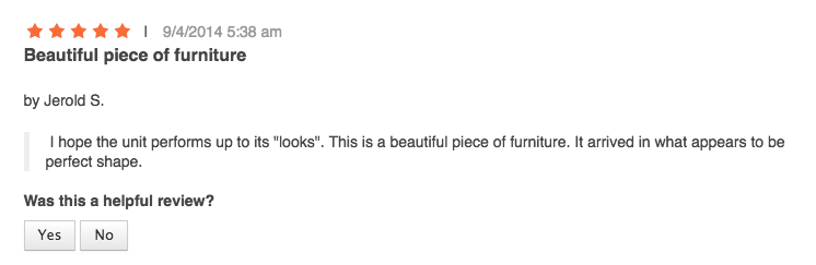
6. Build Shopper Confidence
This can include having a page that showcases customer testimonials or reviews and ratings of each product. Trust seals effectively reduce anxiety and friction during the shopping flow.
7. Personalized Customer Experiences
An example of personalizing the customer’s experience could include offering product suggestions based on their previous searches and purchases or offering content based on geographic criteria. Tailored shopping experiences will show a customer what products you know they would appreciate and make them feel cared for, leading to more engagement and sales.
So, those are our seven main tips to keep in mind when designing your eCommerce website. They all work together towards the same goal: helping your customers find the right product for them and increase your conversions!
Contact our experts for more tips and information on achieving your business goals through a good website design.
Learn more about our NetSuite integrations and our services for everything NetSuite eCommerce:


