
Well-designed eCommerce website forms can make a huge difference in the success of your data collection. Forms should consider the user in their layout and field selection, yet we encounter bad forms almost every single day! Here are nine UX design tips to make your website forms more successful.
1. Collect Pertinent Information Only
You will want to collect the essential information only. Doing so will speed up the process, increasing the likelihood of successful form completion.
Asking for less information also lightens the cognitive load on the user, keeping them fresh and engaged.
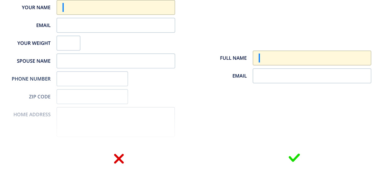
2. Set The Focus To Speed Up Entry
Be sure to focus on the first data collection point on the form when it loads. This saves the user from searching the screen for a start position. Not only does this mean faster collection, but it also helps to eliminate common user mistakes.
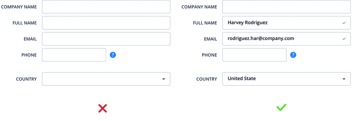
3. Prefill As Much As Possible
You likely have information from the user already. So, help them fill out the form as much as you can! Pre-filling is a quick and easy way to make form filling faster and more efficient. In many cases, the user’s browser automatically tracks country, state, and city. But you should still have these as editable fields for data quality. For example, the current location may not be the respondent’s address.
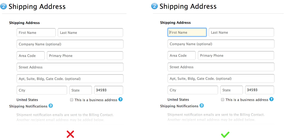
4. Use A Single Column Layout
A single-column layout is more natural for the eye to follow. A form with vertical and horizontal fields forces the user to follow a zig-zag pattern as they provide information. This pattern can cause eye strain and errors.
5. Logically Group Fields
Group the fields that logically belong together. Doing this allows for a reduced cognitive load on the respondent, speeding up the collection and reducing errors.

6. Use Concise and Informative Error Messages
A weak error message can confuse the user and create more errors. You will correct the problem with minimal effort with concise and informative error messages explaining the issue.

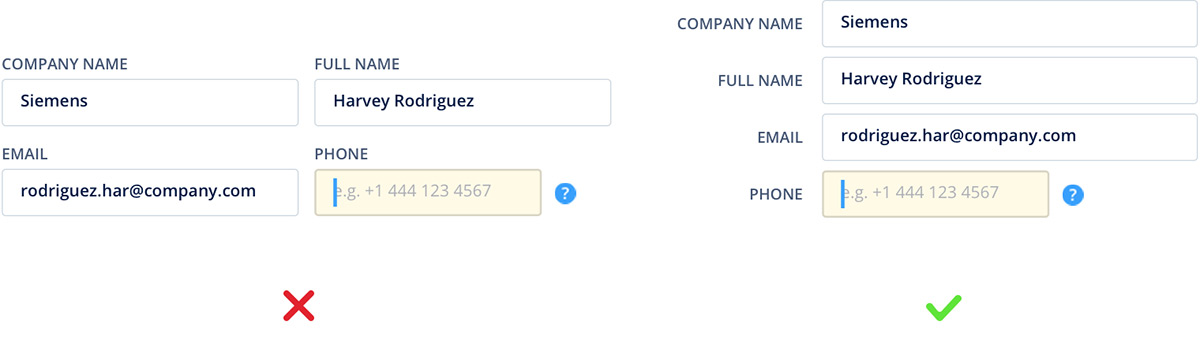
7. Use Input Constraints
One of the best ways to ensure you collect quality data is to use input constraints. For example, a mask for a phone number can validate that the correct amount of digits is received. Another use might be to collect only figures for zip code and payment information.

8. Use Visual Constraints
Visual constraints can help guide the respondent in providing the required information. One use is to have field lengths that closely match the expected input. This gives the user a visual clue about the information they should provide.
The use of visual constraints can also make the form easier to follow, reducing errors.

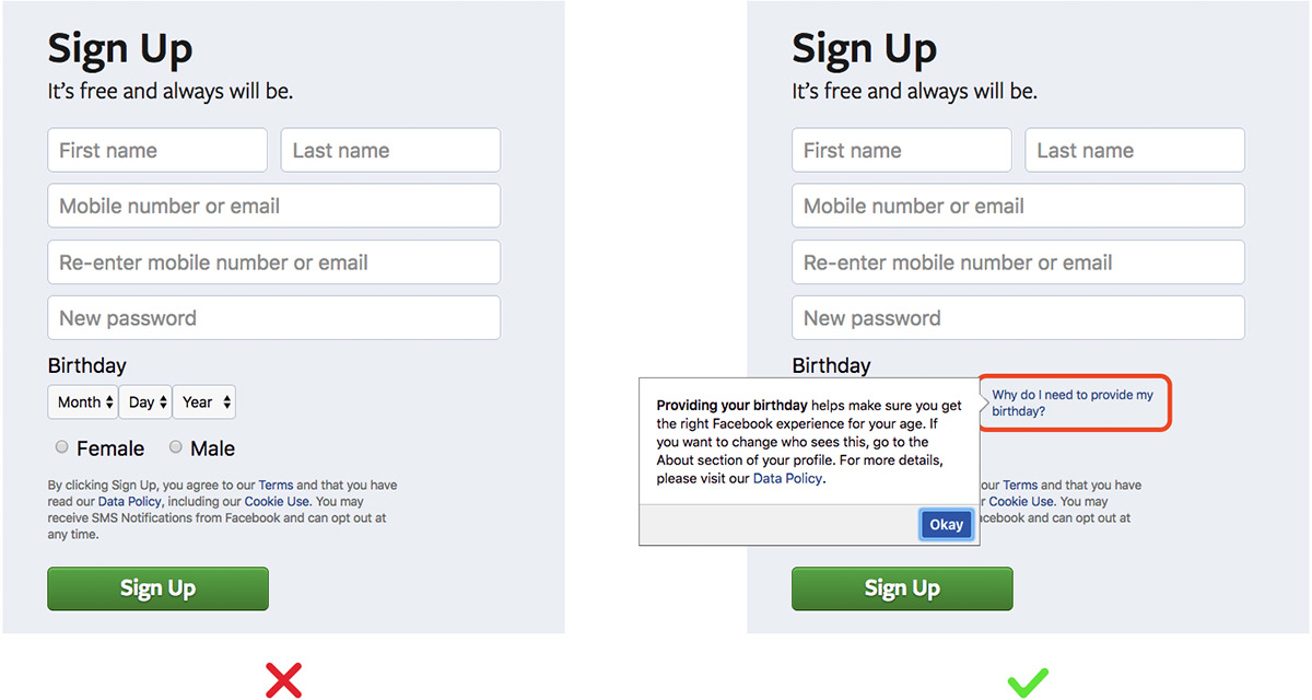
9. Explain the Data Collection to the User
Finally, explain to the user why you’re collecting data. In most cases, you’re requesting private information. Explaining the purpose of the data will build trust with the respondent, and they will be more likely to fill out the form in a helpful manner.
Always remember: keep it simple! Navigating online has to be as easy and smooth as possible if we don’t want to scare potential visitors and customers away.
Contact our experts for more information on good UX design practices, how to make your website more appealing to buyers, and how to scale your NetSuite eCommerce business with a tailored eCommerce growth strategy.
Learn more about our NetSuite integrations and our services for everything NetSuite eCommerce: