
We already gave you some tips to redesign your website and boost your conversions. Today, we want to share with you the most common eCommerce UX mistakes to avoid when designing your site.
Your website may often serve as the first impression of your business to a potential customer: in 2022, 88% of consumers say they are less likely to return to a site with bad UX. When your site runs smoothly, it speaks of your capability and professionalism. Of course, you can fix a mistake when it happens, but it’s best to avoid them altogether.
Here is a list of 10 UX mistakes to avoid at all costs on your eCommerce site:
Credits: Alex Khoroshok
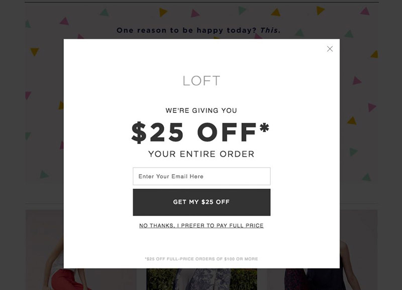
If you do pop-ups, limit the number and make them effective, so you don’t alienate potential customers from your site.
Potential buyers don’t have the opportunity to touch or see a product before they order it, so showcase your products with high-quality images.
Give potential customers as much information about your product or service you can, so they can make the best choice for their needs.
Credits: Signa
Incorrect information will lead to unhappy customers and returns, so make sure that what you put on your site is correct.
If a customer cannot get to an item on your site because your site search is ineffective or the page link is broken, they will most likely buy from your competition.
Long and complicated checkout processes frustrate online buyers. If they can checkout with ease, they are more likely to return to your site in the future.
Credits: Yalantis
Always provide contact information for your business. It makes consumers feel warm and fuzzy inside when they can associate an address and phone number with an online business.
A good portion of those who purchase goods and services online do so with their phone or other mobile device. You severely diminish UX when you do not offer a mobile version of your site.
Customers like to share sales and products they love via social media. Make the items and pages on your site shareable to increase your traffic. Make sure your social media pins do not compete with the Add To Cart CTA, as this is the primary conversion you are looking for!
If you have poor site navigation, customers will have a hard time finding the products or services they need resulting in a loss of sales when they head to your competition’s site.
Credits: Yalantis
Providing a positive UX on your eCommerce site is a must. For more insight or questions, contact our NetSuite eCommerce experts!
Don’t forget to check out our NetSuite eCommerce services too:
NetSuite hit the stage in Las Vegas a year ago and introduced NetSuite The next… Read More
For mid-market B2B brands running NetSuite, two platforms dominate the storefront decision: SuiteCommerce Advanced and… Read More
SuiteCommerce Advanced development is one of the more specialized skills in the eCommerce agency market.… Read More
One of the most consequential SEO decisions for eCommerce merchants is how to structure product… Read More
BigCommerce has become a leading choice for B2B brands building online storefronts. Its B2B Edition,… Read More
Based on an analysis of 7 million websites, SiteLock reported that websites experience an average… Read More


